Core concepts
Data Visualization
Harness the power of Sens.center to transform raw data into interactive, easy-to-understand visualizations. Create dynamic charts, graphs and maps that make your data compelling and accessible.
Visualize your data
Import your data in .csv or .sens formats to our platform.
Use our Visualization chat to make your data visual, build different charts, graphs or maps.
Share your visualizations
All visualizations you create will be saved, and you can share them with people easily anytime. 
Publish your insights
Sens.center not only lets you visualize data but also enables you to integrate these visualizations seamlessly with text and other media. Craft comprehensive reports, articles, and presentations that tell a complete story. Once you're ready, publish and share your work in seconds, reaching your audience with ease and ensuring that your findings make a lasting impact.
- Create a Blog or Pages data collection type
- Go to Edit page and add
Visualizationtype field to the table - Choose a visualization, save your data collection
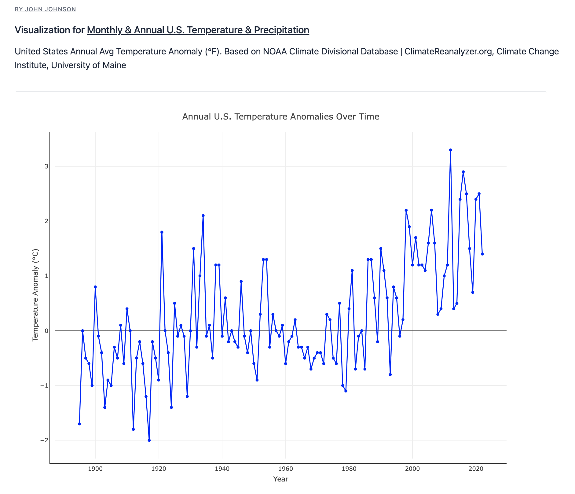
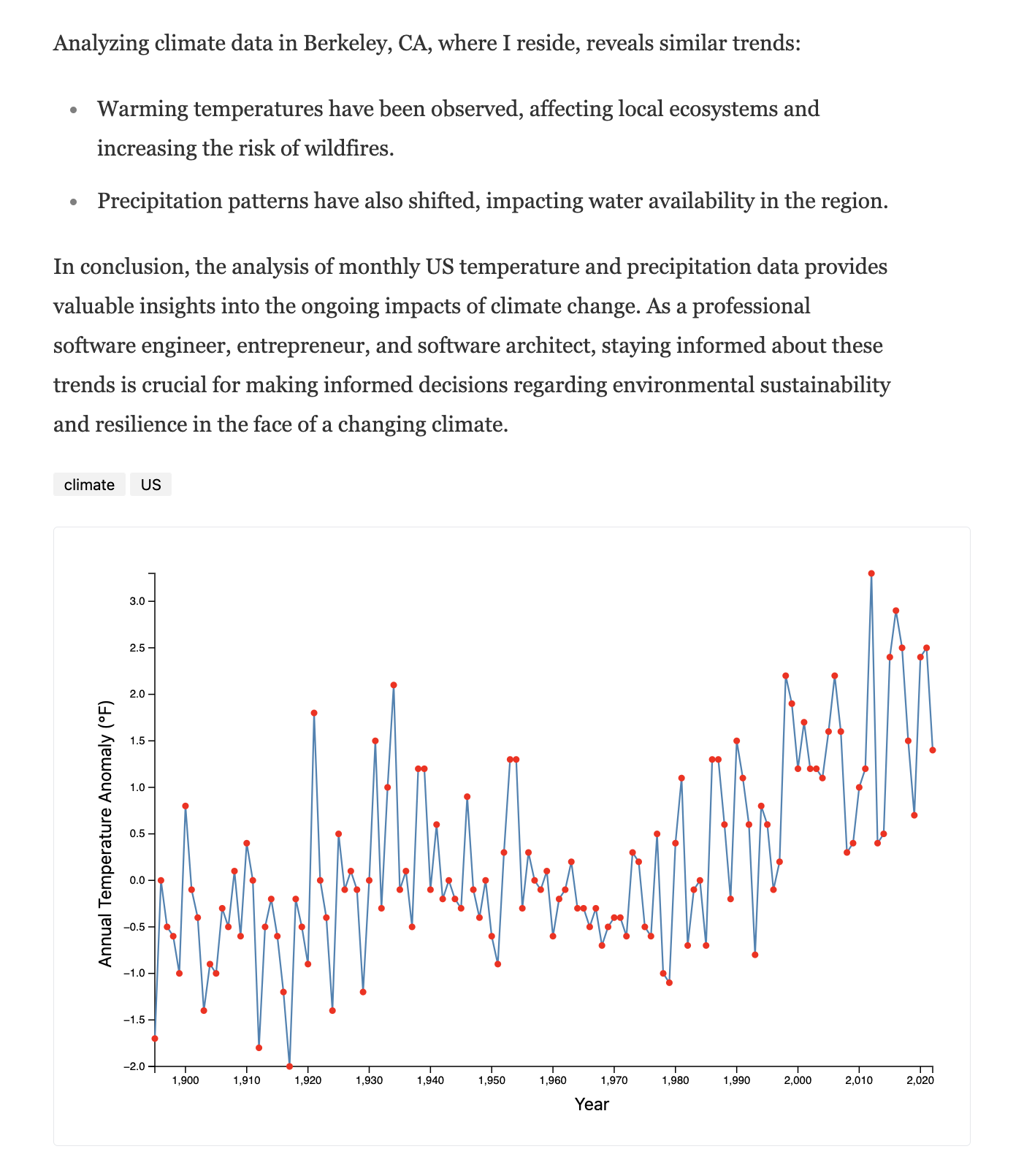
You'll get a similar result: 

